What Makes Your Web Design Click?
Online digital services in general and mobile e-commerce in particular, aim to develop superior designs for enhancing its business model and appearance. By combining real-time data along with predictive analytics, organizations can quickly calculate, iterate and balance between experiential and hackneyed designs. Today, most of the sites are designed keeping customers as the centre point. The intention is to deliver the best of experiences possible that can add value and increase the conversion rates.
Crudely put, if you fall under the not-so-informed latencies, then, you are going to blow your digital sales opportunities. But, if you value customer relationships and are ready to incent innovative changes and efficient investment, then you are closer to increasing your receptivity. If your websites are not progressive, then it is not right, says Forrester. True, but, for this, you need to know your users, understand the nuances and progress consistently to meet the demand.
Let us see how website designs have evolved over the years.
Currently, the global internet users account to approximately 4 billion users. Looking at the past, back in 1989, Tim Berners-Lee, a British scientist revealed the first-ever web browser and World Wide Web that ran for Nuclear Research, CERN. It was a mere text-based site with just blue and black colour text. The site purely described the basic features of the web and a few instructions that guide the reader to access documents and to set up the server. Here is how the first website appeared back in 1989:
Evolution of the Web design trends from 1990
- HTML -
came into place to create the site structure.
- Sites started having “Landing page” from 1993.
- Marketers started using websites to advertise. Banner Ads took its place on several web pages from 1994.
- Javascript gave several options to the web designers.
- From 1996 websites started having text, images and ads that added to its utility and made it more attractive.
- Flash transformed the landscape of web design. It contributed to the era of animation.
- 1998 – Google came into its existence. The Beta version was launched this year.
- Online business slowly started making its way with the facility of online payment. PayPal went live in 2000.
- WordPress, the content management platform went live from 2003 paving way for bloggers to present their ideas widely using this simple and intuitive tool.
- Facebook went live in 2006.
- 2007 – The mobile generation presented their own demand and placed huge challenges to the designers. More trends started pouring in. Aesthetic changes were made in terms of appearance, colour, utility and functionality.
- 2010- Designers and users began valuing “Responsive” web design. It was the beginning of the design adaptation to functionality rather than mere visual elements. Web designs responded to different display devices.
The process has been seeing a huge transformation that lead to “Growth driven Design”.
Have a look at how Amazon website looked back in 2000. With so much of limitations, the site merely had few basic descriptions and display elements.
Here is how the site appeared in 2010: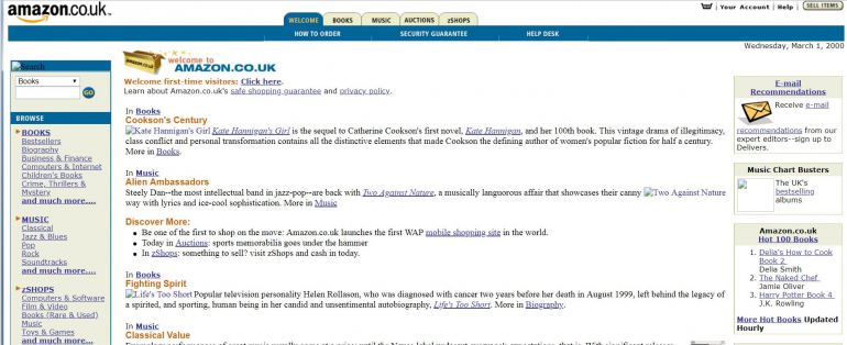
And, here is how the Amazon site appeared in 2018: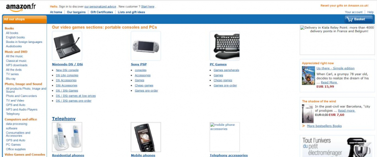
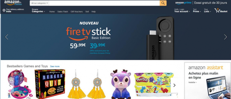
It is visible, that Amazon has mastered the art over these years by relating all the elements and balancing them well. The design and functionality of their website / mobile site clearly indicate that the company has not hesitated to scrap few and to start all over again to give the best of experiences to its users. To evolve and to match with the technological advancement, you should not hesitate to break the chain and make bold moves. Amazon is practising this and many other leading sites are too.
Currently, there are close to 2 billion websites globally. Google is the most visited website, followed by Youtube and Facebook. Let us see how Google managed to present them well digitally.
Have a look at how Google evolved in its web appearance: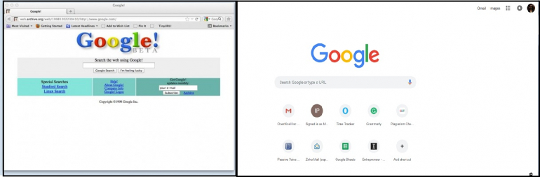
The transformation proves its adaptation of all modern trends and techniques. We can see how the company took bold moves to change the layout, composition, colour, texture, typography, imagery and much more. Google has been setting an example to plan effectively in the present with a predictive vision of the future. This reflects in its web design.
Refresher
Modern web technologies are spurring a renaissance. Today, the focus is more on the user interface and user experience. Marketers majorly rely on the web pages to generate lead and users. Flat designs, shadows, depths, saturated colour schemes, interesting particle background, illustrations, mobile first; prominently bold typography, asymmetrical design layouts, gradients and animations will rule the world of design, says a new report.
Mobile usage has taken over desktop browsing. Minimalism and efficient usability will be the top priorities as this can contribute well towards the speed and page load time. The focus will be to add value by including video and micro-animations. Video should be leveraged for attracting the audience, highlights a recent report on digital marketing statistics. We can see more of single page sites with a lot of multimedia Longreads.
Your website design speaks a volume of your company’s identity. So, go for the best that suits your company and your customer. Speak your users’ interest.
Final Say
If you are a designer, your job does not end with using pixels. You need to go a bit further to generate ideas, research trends, apply the latest technological innovations, and expand boundaries on every project and above all, be more user-centric. The landscape of web design and technologies is expanding to support gemots of experience. Pick up elements that will definitely keep users within the loop. If you are running a business, then evolve with the design needs.
With all of the above-discussed points in mind, if you’re building or updating existing websites, you can be sure to be right on the track. Ask why you are doing this and for whom you are doing this. After all, it is not just about the visuals and functionalities; web design is about the utility too. It sums up to three words; discover, explore and implement.
About the author

Copyright © . All Rights Reserved


