Responsive Design: What You Need To Know
There is nothing new about responsive design; it has been around since 2010 when Ethan Marcotte coined the term for an article in A List Apart. But there is no doubt that in a little over three years it has completely changed the way web designers work.
Responsive Web design Books- Responsive Web Design (Brief Books for People Who Make Websites)
- Responsive Web Design with HTML5 and CSS3
- Implementing Responsive Design: Building sites for an anywhere, everywhere web
- Responsive Design Workflow
- Quick Guide How To Get Your Site Ready For Every Device And Browser
- Responsive Web Design by Example
- Getting The New Baseline In Web Design Right
- Responsive Web Design Overview For Beginners
An updated UX/UI Design Book List for 2025
Responsive design is everywhere nowadays, and we can thank the growing mobile device industry for that. In fact, according to Pew Internet, 55 percent of Americans said they'd used a mobile device to access the Internet in 2012; 31 percent of them say that's the primary way they access the web. So if you still have questions about responsive design, read on...
What responsive design is
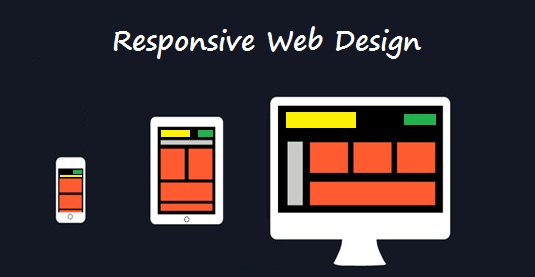
Before anything else, you need to have an understanding of what it means for a website to be responsive. A responsive website is one that adjusts to the display size of the visitor's device. Because of the rise in smartphones and tablets, designers had to come up with a way to ensure that their sites looked just as good on the smaller screens as they did on a full-sized desktop monitor. To do this, media queries are used to detect the device or the resolution of the visitor's device, and a combination of flexible images, type, and grids adjusts the display to fit the screen.
Responsive design is not the same as mobile-friendly
Mobile-friendly sites were seen as one solution to the growing mobile trend. Visitors who arrived at a site from a mobile device were redirected to a completely different URL for the mobile version of the website. This meant that two sites needed to be created and maintained.
The responsive route only requires one site to be developed.
A love affair with fluid grids
Fluid grids help everything in the responsive world work. Start by defining the maximum layout size for the site, usually 1024px to fit most monitors. The page is then divided into a specific number of columns. Each element is designed with proportional widths and heights instead of pixel based dimensions so when the device or screen size is changed, the elements will adjust their widths and heights by the specified proportions to the container it is in.

Images and typefaces need to be responsive too
Adding an image to a responsive site doesn't make it automatically responsive. The same goes for fonts.
For images, the best results come from script solutions like Picturefill that rely on JavaScript or Adaptive Images that use JavaScript and PHP (on the server side). Many responsive WordPress themes also have built-in capabilities for responsive images as well.
Type can be responsive by using rems instead of px or ems to define size. By first declaring the font size of the html to be 100 percent: html {font-size: 100%;}, you can then adjust the media queries to render the fonts in sizes appropriate to the display: @media (max-width: 640px) {body {font-size: 1.2rem} } @media (max-width: 1100px) {body {font-size: 1.5rem} }.
Frameworks can make things easier
In the world of responsive design, there are frameworks that you can use to structure the layout of your webpages. Essentially, they are similar to templates in the sense that they provide the designer with a foundation to work from. Frameworks predetermine your grid, typography, navigation layout, button styles, tables, etc. The best part is that they have already gone through testing to ensure that they are compatible with the popular browsers.
Frameworks vary from fully functional options to bare bones choices. Some will even include a CSS file that can be changed to match the look and feel of the site without having to code this entirely from scratch.
Emails can be responsive as well
Just as with websites, the number of emails viewed on mobile devices is rising steadily. To make sure that HTML emails look consistent across the different devices a recipient might have, many people have turned to responsive design principles and frameworks to help them design these messages. This practice is becoming so popular that a number of frameworks include an email option as well.
Responsive design is still in its infancy, and there are some kinks that still need to be worked out. Issues like horizontal navigation, tables, and images can present some awkward looks in a responsive site if not planned carefully. As more developers embrace this solution, more advancements in how these problems can be addressed are made available. Until things are perfect, it's best to remember that just like any website, a responsive one needs to be planned and not just thrown together.
Wanna know how to create a responsive web design? This FREE basic guide will help you to start. Read more about eBook or download it via form below:
Related Posts:
About the author
Copyright © . All Rights Reserved
