Tips For Using Typography To Develop Your Brand
Typography is a very important web design skill to learn for a number of reasons. Firstly your clients will need you to be able to convey their core messages clearly on their websites. But typography is also capable of doing so much more than just making sure your clients' business messages are loud and clear. In fact it's as much about helping them build their brand as it is about anything else. If you don't believe me just take a quick look at the biggest brand names out there and how they approach typography - you can learn an awful lot from analyzing the success of others.
Choosing Typefaces
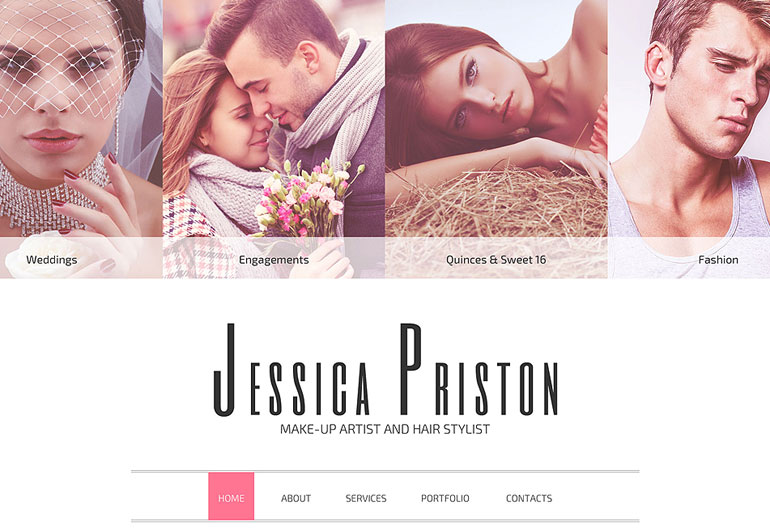
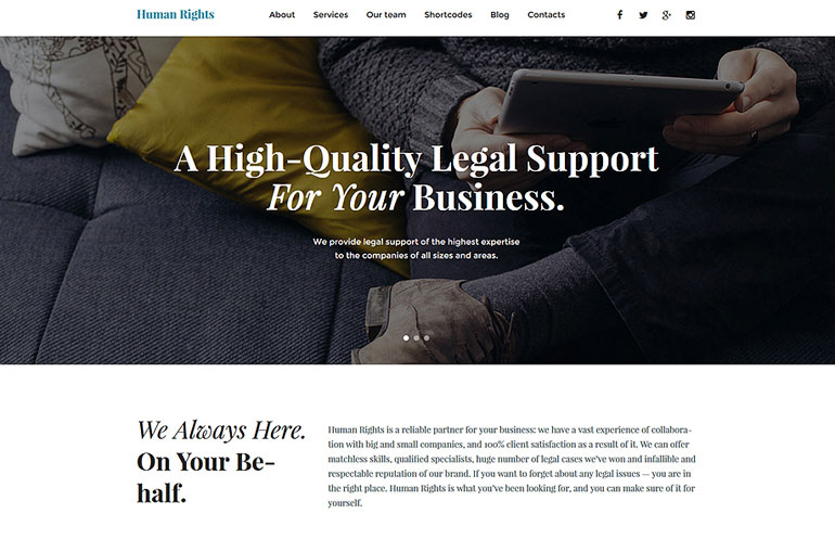
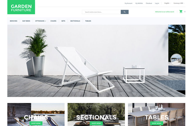
The fonts you choose as a designer can have a dramatic impact on how a brand is perceived. There are certain font families which are austere and formal, while others convey a sense of humor and informality. Just be aware that not all fonts are created equal and that choosing the right typeface could alienate entire swathes of potential customers. Look at how often a major brand changes their typeface i.e. never. There's a very good reason for that, and it's simply that some typefaces work better than others.
Serifs Vs Sans Serif
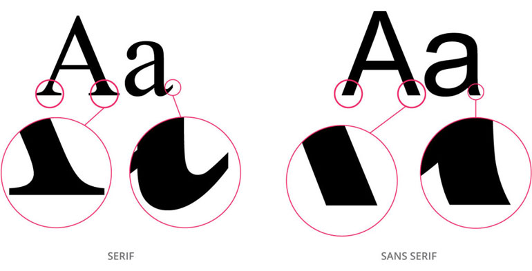
Most of the "default" fonts you'll come across are sans serif fonts, which are fine for everyday use in creating word processor documents or spreadsheets. Where they don't work is when you're working to create a brand which still stands head and shoulders above the competition. Using a default font in your online or offline branding is lazy, to say the very least. Before accepting that default font you should at least experiment with a mixture of serif and sans serif font families - you'll be amazed at how different many of these "basic" fonts are visually.
Psychology of Color
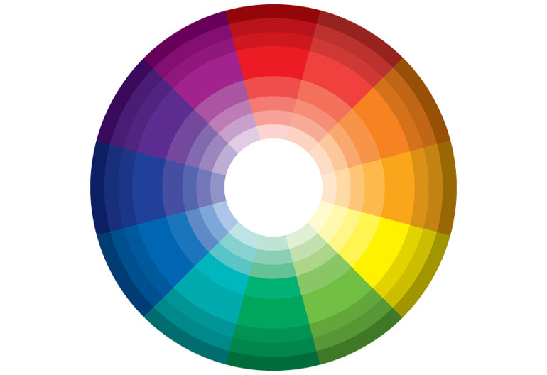
The next thing to look at once you've chosen a typeface which is best suited to your brand is to then look at the color palette you'll use to enhance brand visibility. There's nothing worse than a professionally developed site using garish font colors - nobody will take a brand seriously when it doesn't take itself seriously. Again look at what major brand names do with their color choices for their typefaces, and then implement some of those marketing decisions in your own choices.
Number of Fonts
Nothing (and I mean absolutely nothing else on this planet) annoys me more than coming across a commercial website which has used six or seven different fonts on the same page. This is the first sign of an amateur designer (probably a family member) and absolutely ruins the legibility of the website. So, unless you want to be the butt of jokes from your friends, limit the number of fonts you use on your site to a maximum of three. You don't need any more than three fonts no matter how big or complex a site is. Most professional designers will manage to create a stunning brand presence using just two fonts.
Consistency
Once you've chosen and implemented your typefaces for your brand then don't go changing them in a few months time. Once visitors/customers have become accustomed to seeing a particular typeface as part of your branding any sudden changes can have a dramatic impact with how they interact with your business. The opposite side of this argument is that if your visitors are constantly telling you that they despise your choice of typeface, then take that feedback on board and choose a new typeface for your brand.
Typography has a far greater impact than most businesses really understand, and even the tiniest changes can dramatically improve how your brand is perceived and received. The funny thing is typography isn't actually all that difficult to get right - you just need to stick to the basics of choosing a typeface and range of fonts which match your brand.
About the author
Copyright © . All Rights Reserved
