Secrets of Responsive Web Design
Do you still develop websites for the standard screen resolution (1024x768)? Stop doing it! It makes you look dumb in the constantly developing world of the Web.
The number of people who start using mobile devices and tablets for Internet surfing is growing every day. The iPhone, iPad, all sorts of netbooks, BlackBerry, Kindle...the list of these devices is almost endless. Moreover, the number of additional inventions is constantly increasing. In this situation we are faced with one serious problem - the design of a fixed interface exlusively for a wide screen computer does not make that much sense nowasdays.
At the same time, we can't create several versions of a website for each existing kind of devices. It is absolutely unpractical and almost an impossible task. Technologies are evolving so quickly that before you notice it you'll be able to access the Internet via your fridge :)
So, what is the way out of this situation? And does it exist? Yes, it does. Our problem is easily solved by means of the Responsive Web Design concept , a new widely discussed trend of web design. It is the most simple and the most elegant solution of the problem described above.

Responsive web design is like a new shiny toy for designers and developers. It is hard to overestimate the importance of responsive design because it guarantees that any website will look good in different screen resolutions. I think everyone will agree with me that the first thing that every self-respecting designer, whether or not they have a degree for web design, is to familiarize oneself with responsive web design.
It is achieved by means of combining such techniques as flexible grids, fluid images and media queries. It helps to design a flexible architecture, which will automatically adapt to different conditions and, therefore, will be displayed properly on every screen resolution. No matter how many new devices will enter our life in future, responsive websites will be always able to provide a suitable response.
Subscribe to our newsletter and get a cool eBook "Begginers guide to HTML" for free. We'll send you only useful posts and freebies once in two weeks.
Related Posts
- Responsive Design Books for Smarter Design
- 40+ Best Responsive Design Tutorials
- How to Create Responsive WordPress Web Design?
How to create a flexible grid
Using a flexible grid, we should forget about the fixed width style and centered content. It means that all the elements of our design are resized in correlation to each other. The basic idea of a fluid grid is to use this formula for calculating the proportions of the design in percentage: "target / context = result"
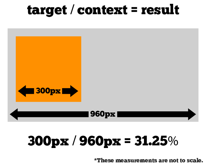

The same formula works for types. We stop using pixel-based sizes, instead we use the em or percentage.
Example:
14 pixels - the body font size;
21 pixels - the H1 font size;
21 ⁄ 14 = 1.5
Your CSS will look like:

At first, you should learn how to make a flexible grid manually. But then you can use some helpful toolkits, which will save your time. Also you can find more information about flexible grids here:
Mobile Responsive Design: The Flexible Grid
Fluid grids, orientation & resolution independence
Fluid grid and responsive web design
Fluid images
The usage of fluid images causes the adjustment of the size to the parent block. The main idea is in the non-obvious usage of the properties of {max-width: 100%}. An image with img {max-width: 100%} will never come out from its parent unit. If the parent block is smaller than the size of img then the image is reduced proportionally. This principle applies to images,objects and video.

Some useful resourses:
Hiding and revealinf portions of images
Fluid Images
Foreground images that scale with the layout
Overflow Image with vertical centering for Responsive Web Design
Basic things you should know about Media Queries
Media queries are needed in order to show the optimized layout for the very resolution, from which at the moment the site is surfed. It is a part of the CSS standard, which allows you to apply styles based on the information about device resolution.
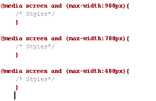
The most widespread pixel widths are: 320px(iPhone portrait, default), 480px (iPhone landscape), 600px, 768px(iPad portrait), 900px, 1024px (iPad landscape). I strongly recommend to consider all these screen resolutions if you want to make your design a responsive one.
Take a look at these useful resources:
Working with media queries
How to use CSS3 Orientation Media Queries
Adaptive Layouts with Media Queries
The W3C specification for CSS3 Media Queries
The principle of mobile first
For a long period of time all websites were designed only for desktops and the process of browsing the Web on mobile phones was painful. But technologies are changing and the principle of Mobile first is becoming more and more widespread. This technique means that your styles are gradually developed from a simple base. Scilicet, the site is created initially for the devices with less capacity and then we add different features, using Media Queries and CSS3. In this case the "stupid" browsers that don't support media queries will get the simplest content (such as for mobile phones). And more advanced browsers will deal with media queries.
However, there is also some bad news. As it was expected, the IE 6/7/8 do not support CSS3 Media Queries. In this case the usage of a CSS pre-processor like Sass will be of great help. I have found some useful guides how to solve the problem with IE 6/7/8. Check them:
"Mobile first" CSS and getting Sass to help with legacy IE
Mobile First: solving IE vs. Symbian
Using Sass to Help Internet Explorer Handle 'Mobile-First' Designs
How does it look in practice?
Now it's time to share with you one very simple example how to create the web design that is a responsive one from a desktop size down to a mobile version. It is actually simpler than you think, even if you are a newbie ;)
The first step we should do is to include a meta tag "viewport" into <head> to tell the browser that this webpage is optimized for mobile.
Let's create a basic HTML structure of our template. As you can see below, the template consists of four blocks: the header, content , sidebar, and the footer.
HTML Structure
01. <div id="wrap">
02. <div class="header">
03. <h2>Header</h2>
04. <p>Some logo design here</p>
05. </div>
06. <div class="content">
07. <h2>Content</h2>
08. <p>Lorem ipsum dolor sit amet, consectetuer adipiscing elit. Morbi aliquet euismod nulla. Maecenas facilisis consectetuer purus. Nulla vestibulum molestie elit. Pellentesque pellentesque. Donec congue tempus velit. Sed aliquet risus ut sem. Vivamus et diam eu dui tincidunt viverra. Mauris malesuada pede nec justo. Nulla pulvinar. Pellentesque tincidunt nisi sit amet odio.</p>
09. <p>Nunc adipiscing venenatis lorem. Sed sit amet tortor vel enim lacinia mattis. Aliquam dapibus rhoncus turpis. Etiam tincidunt quam ut urna. Aenean vel tellus. Morbi risus. Vestibulum ut nunc. Praesent orci. Curabitur pharetra, quam ut euismod tempor, augue ligula convallis massa, ut dictum arcu augue in tellus. Donec condimentum mi a magna. In velit. Curabitur accumsan mattis ante.</p>
10. </div>
11. <div class="sidebar">
12. <h2>Sidebar</h2>
13. <p>Nunc adipiscing venenatis lorem. Sed sit amet tortor vel enim lacinia mattis. Aliquam dapibus rhoncus turpis. Etiam tincidunt quam ut urna. Aenean vel tellus. Morbi risus. Vestibulum ut nunc. Praesent orci. Curabitur pharetra, quam ut euismod tempor, augue ligula convallis massa, ut dictum arcu augue in tellus. Donec condimentum mi a magna. In velit. Curabitur accumsan mattis ante.</p>
14. </div>
15. <div class="footer">
16. <h2>Footer</h2>
17. </div>
18. </div>
Write arbitrary CSS for your future template:
01. .header{
02. height:150px;
03. width:950px;}
04. .content{
05. position:relative;
06. float:left;
07. width:600px;}
08. .sidebar{
09. position:relative;
10. float:right;
11. width:300px;}
12. .footer{
13. clear:both;
14. height:150px;}
15. #wrap{
16. background-color:#CCC;
17. color:#69C;
18. font-family:"Trebuchet MS", Arial, Helvetica, sans-serif;}
Adding Media Queries is the most interesting feature of the responsive web design! Let's start! We will create some rules for different viewport widths.
/* for 980 or less*/
@media screen and (max-width:980px){
#pagewrap{
width:94%;}
.content{
width:65%;}
.sidebar{
width:30%;}
}
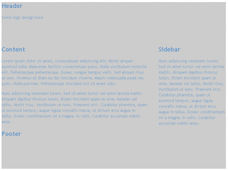
Here is our simple result :)
/* for 700 or less*/
@media screen and (max-width:700px){
.content{
width:auto;
float:none;
}
.sidebar{
width:auto;
float:none;}}
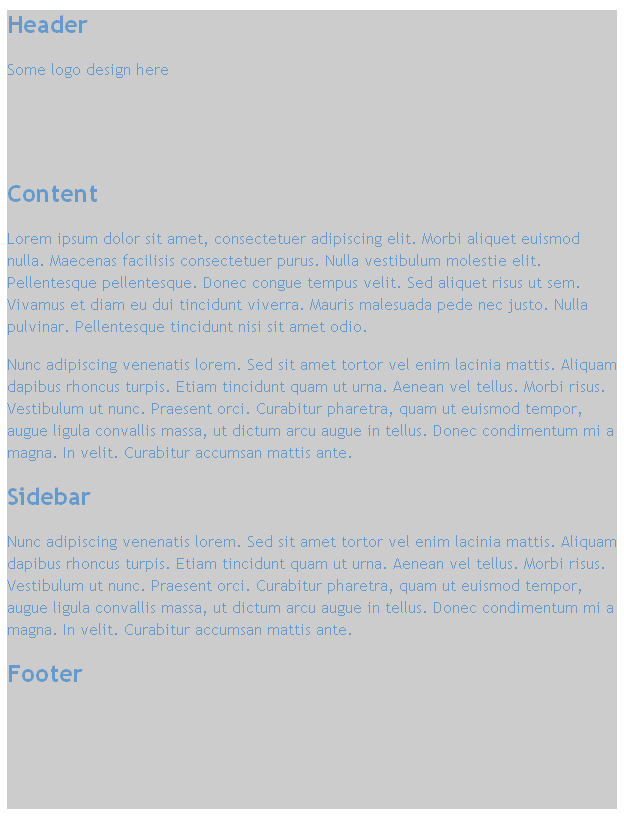
As for the devices with a small desktop resolution, we need to separate the major content because of free space lack. CSS allows us to show and hide content:
/* for 480 or less*/
@media screen and (max-width:480px){
.header{
height:auto;}
.sidebar{
display:none;}
}
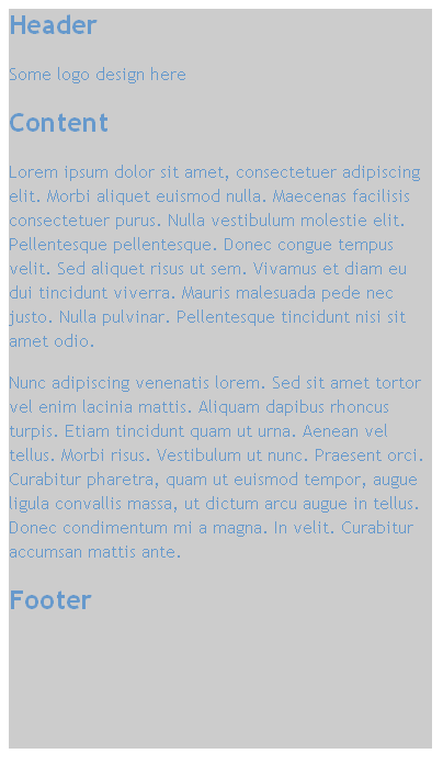
As you have already guessed, you can write rules for each desktop resolution you want. Media queries are the future of the Web. Novertheless, some browsers don't support them. That's why for IE we should use some scripts. Add the following into <head> :
<!--[if lt IE 9]>
<script src="http://css3-mediaqueries-js.googlecode.com/svn/trunk/css3-mediaqueries.js"></script>
<![endif]-->
Need more info about responsive web design? Here you go:
The ultimate responsive web design roundup
Responsive Web Design Tools and Services
Responsive Web Design Techniques, Tools and Design Strategies
Resources For Responsive Web Design
Responsive Web Design, most complete guide
A piece of sweet inspiration in conclusion
Searching on the Internet, you can find a lot of information about responsive web design. But today I want to inspire you by showcasing awesome responsive designs. I want to push you further in order to learn more about creating responsive web design. I want to turn you over to the dark side, Luke :)
Let's get started!
All the examples are provided by Mediaqueri.es
Ginger Whale

Dulla
Performance Marketing Awards
Crush + Lovely
Heathlife
Fico
Bricss
Atommica

Fray
If you look at the stats, you'll behold that more than 33% of users use mobile browsers for Internet surfing. And their number is growing every day. Every business owner should make the life of his customers easier and more enjoyable. And the first step on this way is to use responsive web design for your website.
Free Responsive Design eBook
Wanna know how to create responsive web design? This FREE basic guide will help you to start. Read more about eBook or download it via form below:
About the author
Copyright © . All Rights Reserved


