5 Color Choices You Absolutely Must Avoid When Designing for the Web
The Web is becoming more visual all the time. Good content remains king, but that content had better be wrapped in an appealing visual package in order to stand out.
For design professionals, that isn't so much of a problem. They're thoroughly steeped in color theory and color psychology.
But what about the growing number of web denizens who are trying to keep their web content up to speed with the growing visual nature of the web? Even those web articles that summarize color theory and color psychology, while excellent in sharing the basics of color in design, can be misinterpreted by those who don't have the background that graphics professionals do, leading to potential disastrous decisions.
So what color choices must you absolutely avoid in your webpages?
Pure Black
Let's start with black - pure black - what is coded as #000000 in HTML.
Surprised? Black is everywhere, isn't it, like in the text on most webpages, the ubiquitous little black dress and the nighttime sky?
Well, pure black is less common that you think. That true #000000 pure black is actually an unnatural color. It doesn't exist in nature. Pure black requires the absorption of all spectrums of light, and that simply doesn't happen in nature. Natural colors are more blended and subdued.
Pure black, therefore, is not something that our eyes are accustomed to seeing. It's harsh. It stands out (which is part of what makes that little black dress so popular). Then why not use it in web design? After all, web articles that touch on color psychology stress its connection to glamor, sophistication, power and authority. Are those articles wrong when they encourage the use of black?

They're not wrong at all. Black can be used to stir some powerful positive associations in people's minds. The key is to use a black that is not pure black.
Because pure black not a natural color, it's harder for the brain to process. Bump your black up from #000000 to #111111 or a similar very dark gray and you'll still get the eye-catching benefits of the color black without putting as much of a strain on your visitors' brains.
Neon colors in interface elements
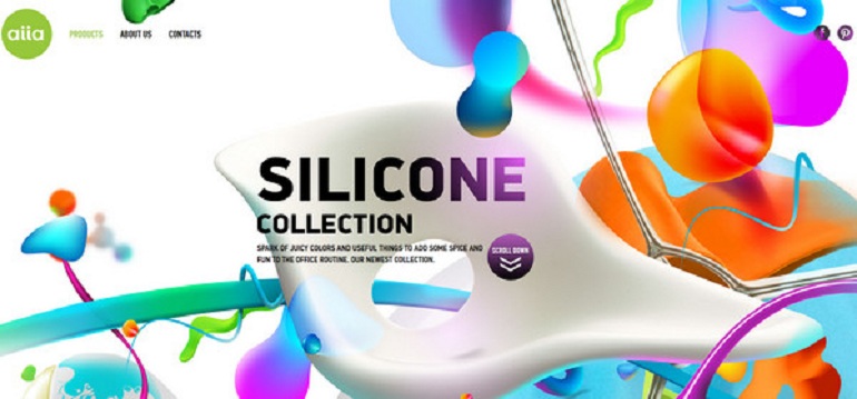
Neon colors, too, while eye-catching, have that same tendency to overwhelm the brain. As colors that don't appear in nature, they are unfamiliar to the brain and harder to process than more muted, blended colors.
Save the eye-popping neon colors for graphic highlights to make your visual content pop instead of in your interface elements. And be sure you use them not just to draw attention to the graphic, but to draw the visitor's attention to parts of your page where key information resides.
In other words, keep neon colors out of backgrounds where text will be superimposed on it, such as backgrounds for your main text, sidebars, navigation ribbons or buttons.

Use more natural, lightly blended colors that are easier on the eyes as backgrounds to your textual content. Neon colors as text or in text backgrounds tend to tire the eyes. This can leave a subconscious negative impression of the website and what it offers, which is the last thing you want. You want to leave your visitor with a positive feeling about your business.
A general rule to cover the first two color choices to avoid, is to avoid colors that in HTML coding feature the extremes on the color spectrums - the zeroes and Fs, especially in text and text backgrounds. Bump them slightly away from the unnatural absolutely pure colors and they will be easier for the mind to process, and leave a more favorable impression on your visitors.
Overly high-contrast combinations
In addition to avoiding overly pure colors, be careful with certain combinations of colors.
Although a staple of the Christmas season, red and green pose a number of problems in site design - so much so that a little poem among designers goes,"Red and green should never be seen, without a color in between"
That's because of the way the brain processes those two colors. Red registers as the warmest color and stimulates activity in the brain. It's the color that most quickly gets our attention. Red agitates the brain.

Green, on the other hand, registers as a cool color. It calms the brain. Putting the two together puts the brain in the uncomfortable position of processing a visual that simultaneously tries to agitate and calm it. It leaves the brain in conflict. That's not good for creating a favorable impression.
As with the aforementioned use of neon colors in text or in text background, using red and green together can leave your visitor with a negative subconscious impression of what you offer that has nothing to do with the offering itself. Instead, that negative impression comes from the internal discomfort of processing the clashing colors.
Red and green also have a second problem. Culturally in the Western world, people are accustomed to associating red with stop or no, and green with go or yes. Again, it forces the brain to deal with a contradictory set of inputs that makes the brain uncomfortable. And when the brain is uncomfortable, it will transfer that feeling of uneasiness to your offering - not at all what you want.
Although not as extreme of a contrast, the same principle applies to the combination of red and blue and, to a lesser degree still, to any combination of what are called secondary colors, namely purple, green or orange.
Red and blue create a clash between a very warm color and very cool color. Secondary colors, which are blends of the primary colors (purple is a blend of red and blue, green a blend of blue and yellow, orange a blend of yellow and red) simply do not mix well. Any of these combinations simply are too powerful of a contrast for the brain to process comfortably.
Again, strive for more natural, blended colors that avoid the brain-straining combinations that come from using colors that are directly opposite each other on the color wheel, or that are opposites in terms of warmth and coolness.
Overly low-contrast combinations
That doesnâ??t mean, though, that you should use only colors that are nearly identical in hue (color) and value (relative darkness). You can go too far in that direction, too, creating a different kind of problem for visitors.
Placing light text on a white background, such as pink or yellow or light blue or lavender on white, can make it hard for visitors to make out what the text says. The same goes for dark text on a dark background, such as red or royal blue or magenta on black.

Other specific bad combinations are yellow on green or green on yellow, and red backgrounds with black, blue website templates or magenta. Not only do you run the risk that a color-blind visitor may see no text at all, but you will irritate non-color-blind visitors by making them strain to read what you've written. And we're not talking about subconscious impressions here. We're talking about them being consciously irritated at you for making your website so hard for them to read.
This error is especially prevalent when you superimpose text over images, such as in a large header image at the top of your page. Always make sure that ALL of your text reads clearly on your header images, not just the majority of it.
Multicolor backgrounds
Websites that offer free textured background to web designers abound, and you may feel that they will make your website stand out. But be careful if you chose to use one. Textured backgrounds run the risk of being busy and thus distracting visitors from your content. And you face the same danger of text getting lost in textured backgrounds as you do with superimposing text over images.
Be careful in your choice of a textured background. Avoid the eye-stabbing, color-clashing backgrounds popular in the early Internet days. Those backgrounds were often made up of tiny repeating designs with bright, clashing colors in which text easily got lost.
The trend today is for a subtle, natural look that gives your background a feeling of depth without being distracting. And the general rule of thumb for color palettes for websites is to use no more than three colors, definitely no more than four.

The same warning to be cautious in your use of textures applies to your use of gradients (a graphic element where the color or darkness of a background changes gradually from one part of the background to another). Avoid using them for multiple blocks of text on a page. And avoid using a gradient that includes the color of your text, so that your text doesn't get lost in the gradient. Always place your text in boxes or in clear area of your background, with enough space from other visual element so your text stands out clearly.
Conclusion
Choosing colors for a website clearly involves more than picking out your favorite colors or a set of colors that you liked on another website. It involves more than taking an isolated recommendation from an online article as all there is to know about color choice without learning more.
Color is a very powerful tool in persuasion. Used carefully, it can help move visitors toward an action you want them to take. Used carelessly, it can leave visitors with a vague sense of unease about your business or even leave them consciously irritated with your site's difficulty of use.
Focus your color choices on ones that are easy on the brain, and continue to learn how to choose colors that work well together and you'll be well on your way to designing a site where your colors work together with all the other elements of your site to accomplish your goals.
About the author
Copyright © . All Rights Reserved
