6 Examples of Great SaaS Website Designs

With the ever-growing need for businesses to stand out in their various fields, it is becoming quite evident that business websites are simply more than just aesthetics. If your website is not geared towards raking in profit on a large scale, is it really working to your advantage?
Software-as-a-Service (SaaS) has one clear message: Your website should convert visitors to sales, and if your website hasn’t been achieving this effectively, perhaps, it’s time to look into a SaaS website overhaul.
First impressions matter much, and so, while aesthetically pleasing websites are great, studies show that in the next three years, that simply won’t be enough. You may not even have enough visitors on your site because it simply won’t stand out among the incoming influx of SaaS-compliant websites.
Are we starting to get your attention?
Before you start to fret, we have compiled a list of 6 great SaaS-focused websites that can inspire you as you plan to give your website an upgrade. Find them below.
Dropbox
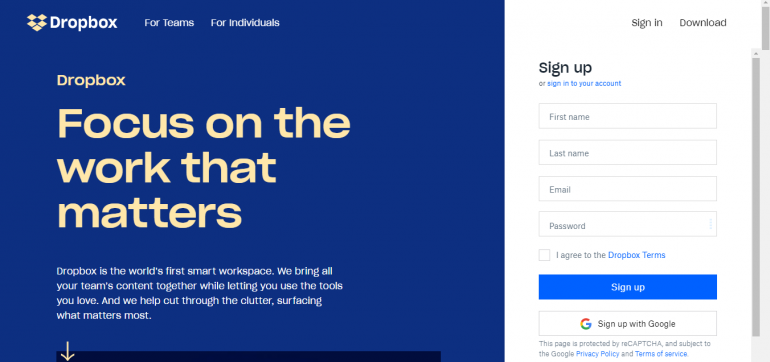
This is one website design that would be suitable for long-standing and well-known businesses in their given fields.
Firstly, we like that this website is clean and easily navigable. Its excellent user interface will help new users find their way around easily. However, you would notice that words are sparse on the homepage of this website.
It sports a simple and straight to the point sentence that gives users a clue about the kind of services that DropBox provides and then offers users the opportunity to sign up for the service with a simple signup form on the same page.
In 2019, DropBox was mainly focused on having users sign up to the site as the entire homepage housed the sign-up form for users to get right to using their services. But a SaaS-focused homepage came to play in 2020.
The catchphrase Focus on the work that matters in large, legible font already piques users’ interest in the possibility that DropBox will now help them to prioritize the most critical tasks - something that many DropBox users crave.
They also eulogize the company below the catchphrase for new users to get familiar with their services. Only after they have reassured users that they really do provide what they seek, you find the sign-up form.
It is a simple form, which is another plus because nobody likes lengthy and complicated forms. This website design is best for popular businesses because they are already well known. For startups, you might need a bit more text on your screen to convince users and make them interested in your product.
MailChimp
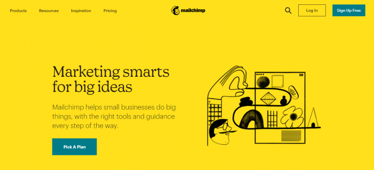
Simple and engaging is quite possibly the look that the MailChimp website was gunning for, and we think they have achieved that quite stunningly.
This service understands that its website’s real intention is to get the core of the business across to visitors immediately. This is one of the hallmarks of SaaS, and MailChimp has modified its website to align with converting sales once visitors check out their page.
First of all, take a look at the large and straight to the point CTA that graces the landing page. This gets the point of the service across to the visitors immediately. You also can’t overlook the easy to navigate menu at the top of the screen that takes users exactly where they need to go.
There is no need to get lost in a maze of menus simply trying to find the service’s pricing. This website design is also what you can describe as “clean.” There are no unnecessary bits of information that will cloud the real message being passed.
It features only what is necessary. This type of web design is suitable for almost all business-types.
JotForm
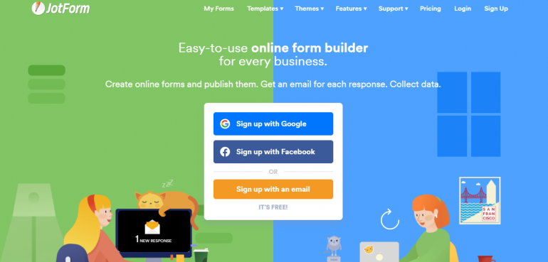
Based on some analysis by SEMRUSH, this website got a whopping 81/100 as its authority score. JotForm is quite deserving of this score because they really did pass the SaaS website design test.
Although the website is aesthetically pleasing and engaging with animated graphics covering the page, this does not deter visitors from the main message they want to pass.
In three short and simple sentences, they tell visitors what their business does and what they can use their business to do.
We can say that this website is high-achieving because it boasts of about 760,000 organic visitors monthly.
With this many visitors on the site, the average revenue per user may start to touch the roof. And we wonder why some businesses perform so well. They have got the foundation right with a supplementary SaaS-focused website such as JotForm’s.
SproutSocial
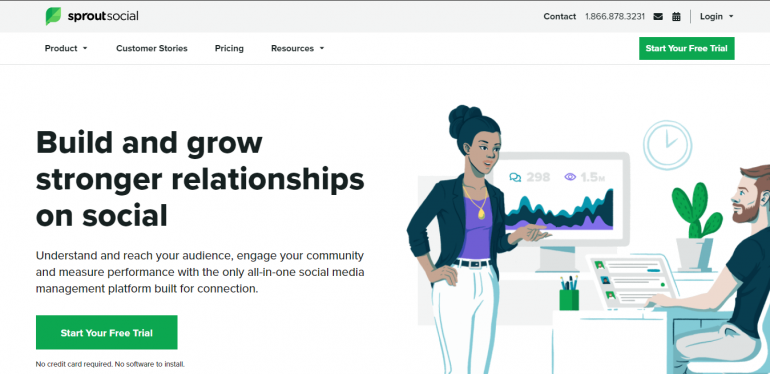
Calls to action are essential parts of clinching the deal when it comes to making sales. Getting it right once and for all means never-ending sales conversions.
SproutSocial made sure to get their call to action right on their landing page, and this is one of the many reasons we think this website is excellent. It has the call to action on strategic parts of the screen, very hard to miss.
Again, the company made sure to use a decisive element in many calls to action, the word free. Everybody loves free stuff, and so it’s almost certain that after finding that the business aligns with their needs, they would sign up for a free trial.
Another element of SaaS that this website employs is the array of customers’ logos on the bottom of the screen and the number of customers the service works with.
These customers are popular and reliable companies. It’s a great way to prove yourself as valuable and tell potential customers that you can handle their needs regarding your business.
Slack
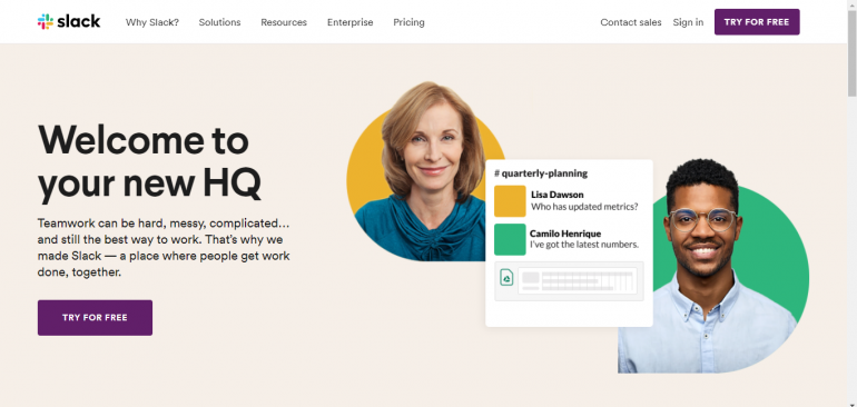
Slack is one of the most-loved websites by millions of remote workers and productive teams worldwide.
The SaaS magic begins right from the layout and website design. Slack took the simple yet engaging approach because it knows that its target audience is young adults and older folk.
With a blend of concise text and big, bold letters, it passes its point across to visitors. Showing them exactly what they need to see about the site and why they should use their services.
You would also find a precise and straightforward menu at the top of the site that is clean and clear. Try for Free is the magical call to action that appears on numerous locations on the screen.
Slack employs bright colors to enhance the uniqueness of the site. Colors are used to highlight major areas in the site that need a user’s attention. Also, the site uses graphics to break down important matters into bits for easier access.
Slack’s web design is great for companies involved in analytics and breaking down of complex information. Graphics, colors, large text, etc. help simplify procedures in an easy-to-understand way, regardless of the user.
Slidebean
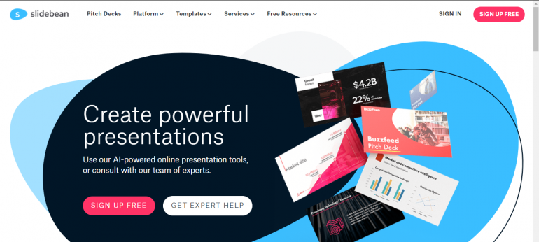
Slidebean is our final website inspiration. It wraps up this list nicely by taking simple to the next level.
As a website that caters to users in need of presentations slides, pitch deck, and other related documents, Slidebean cannot afford to slack on SaaS elements on their site.
The Slidebean site sports the Sign up free call to action; it also indicates that users don’t have to go through the tedious payment procedures of filling in card details.
At first glance at Slidebean’s site, there is no overload of information. While graphics are significant for website design, Slidebean uses an uncomplicated image to pass across its message.
Of course, it features the big letters that catch the visitor’s attention and pairs it with smaller letters for the rest of the information.
Slidebean also does wonders with its color scheme. Notice how there is a lot of whitespace for easy readability and the use of bright pink as the CTA highlight? That’s great SaaS!
Mistakes you might make as you redesign your website
- Using irrelevant visuals: Remember that your website is built to convert sales and not just please the eyes. Only use graphics that are relevant to your site, i.e., pictures that illustrate what your business has to offer. For instance, if you own a beauty brand website, you can use glitter backgrounds and colourful images.
- Forgetting the ‘F’ word: Free always does the trick. Even if the entire service is not free, offering a free trial works just as well. ‘Sign up for free’ will get users hopping on your service for a chance at getting something for nothing.
- Features overload: We understand that your site is super-capable and up to the task, laden with useful features to help get the work done. But do your clients know the benefits of those features for them?
Pick any feature. Ask yourself, “What can this feature do for my customers?” Now highlight those answers on your website for a stronger impact.
Conclusion
One thing is evident among all these sites listed above; the goal of their website is to convert leads to sales. Human beings are primarily moved to action by what they perceive to be an urgent need.
As long as your website convinces visitors about the urgency to use your services, you’re on the right track. Also, look out for some costly mistakes you might likely make as you start to redesign your site. We have highlighted a few above.
Copyright © . All Rights Reserved