Color Psychology in WordPress Design

Color psychology is a fascinating field that delves into different colors' emotional and psychological effects on human behavior. In the context of WordPress design, incorporating color psychology principles can significantly enhance the user experience and drive desired actions. Whether it's encouraging users to make a purchase, subscribe to a newsletter, or simply explore your website further, the strategic use of color can make all the difference.
In the competitive landscape of UI/UX design and development services, understanding the nuances of color psychology is paramount to creating impactful WordPress websites. Colors have the extraordinary ability to influence emotions, shape perceptions, and guide user behavior. By harnessing the principles of color psychology, designers can craft visually stunning and engaging websites that resonate with their audience on a deeper level.
Understanding Color Theory
To effectively utilize color psychology in WordPress design, it's essential to grasp the fundamentals of color theory. At its core, color theory explores how colors interact with one another and the emotions they evoke.
Primary Colors
These are the building blocks of all other colors - red, blue, and yellow. Understanding primary colors is crucial as they cannot be created by mixing other colors. They serve as the foundation for color mixing and blending.
Color Wheel
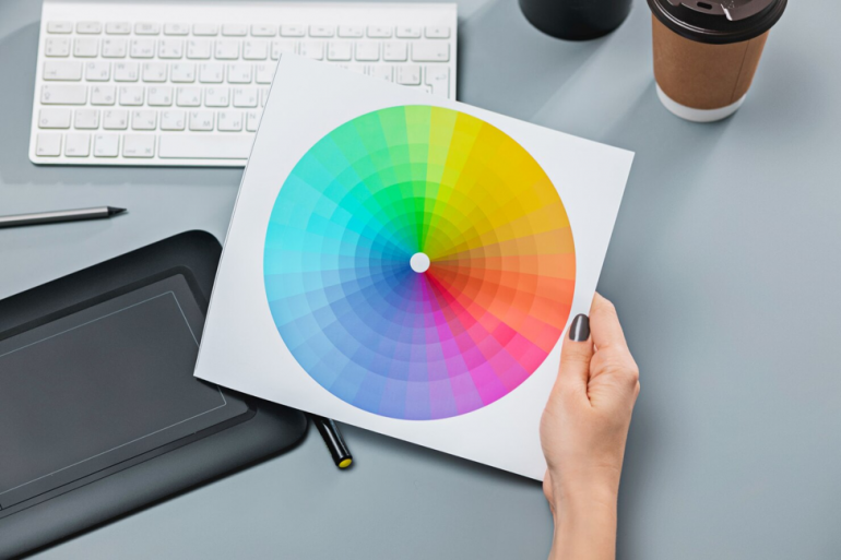
The color wheel is a visual representation of the relationships between colors. It consists of primary, secondary, and tertiary colors, arranged in a circular format. Designers use the color wheel to create harmonious color schemes and combinations that resonate with their audience.
Warm vs. Cool Colors
Warm colors (e.g., red, orange, yellow) evoke energy, passion, and warmth, while cool colors (e.g., blue, green, purple) evoke a sense of calmness, serenity, and professionalism. Understanding the psychological effects of warm and cool colors allows designers to evoke specific user emotions and responses.
The Impact of Colors on User Experience
Colors play a pivotal role in shaping user experience on websites. Different colors elicit various emotional responses and perceptions, ultimately influencing user behavior.
- Red: Often associated with energy, urgency, and excitement, red is commonly used for call-to-action buttons and alerts to prompt immediate action from users.
- Blue: Symbolizing trust, stability, and professionalism, blue is frequently employed in corporate websites and financial institutions to instill confidence and reliability in users.
- Green: Green represents growth, health, and nature. It is prevalent in eco-friendly and health-related websites, creating a sense of freshness and vitality.
Understanding the psychological impact of colors enables designers to strategically incorporate them into WordPress designs to evoke users' desired emotions and actions.
Implementing Color Psychology in WordPress Design
Now that we've explored the fundamentals of color psychology and its impact on user experience, let's delve into practical strategies for implementing these principles in WordPress design:
- Choose a Dominant Color. Select a primary color that aligns with your brand identity and resonates with your target audience. This dominant color will set the tone for your website and establish a cohesive visual identity.
- Create Contrast. Ensure readability and accessibility by using contrasting colors for text and background. High contrast improves readability, especially for visually impaired users, and enhances the overall user experience.
- Use Colors Strategically. Guide users' attention and influence their actions by strategically placing important elements in attention-grabbing colors, such as call-to-action buttons. Understanding how colors affect user behavior allows designers to create intuitive and engaging WordPress websites.
Best Practices for Choosing Colors in WordPress Design
When selecting colors for your WordPress website, consider the following best practices to create a visually appealing and cohesive design:
- Understand Your Audience. Research to understand your target audience's preferences and psychological responses to different colors. Tailoring your color scheme to your audience can enhance engagement and drive conversions.
- Maintain Consistency. Establish brand recognition and reinforce your brand identity by maintaining consistency in your color palette throughout your website. Consistency fosters trust and familiarity, making it easier for users to navigate your site.
- Test and Iterate. Continuously monitor user feedback and conduct A/B testing to refine color choices and optimize user experience. Testing different color schemes allows designers to identify which resonates best with their audience and drives desired actions.
Harness the Power of Color Psychology
Incorporating color psychology principles into WordPress design empowers designers to create visually stunning and emotionally resonant websites that captivate audiences and drive results. By understanding the psychological effects of different colors and strategically implementing them, designers can elevate the user experience and leave a lasting impression on visitors. Harness the power of color psychology to unlock the full potential of your WordPress design and differentiate your website in a crowded digital landscape.
Copyright © . All Rights Reserved