Why Good Design Sells: The Role of UX in Ecommerce Success
Take a look at what asos.com looked like back in 2004. Oh, and by the way, those little stars around the logo up top were twinkling away.
Yeah, in 2025, it makes us squint and look away. But let’s focus on the UX elements here.

Right in the center, there’s a banner offering a discount for signing up. Over on the right, a column highlights bestsellers and the deal of the day. Down at the bottom (not visible on the screenshot), there’s a banner assuring safe online shopping.
We’re trying to say that, despite the obvious pink overload, this website had solid marketing and UX hooks and elements that faithfully boosted its sales.
So, let’s dig into why design is more than just a pretty picture and how UX drives ecommerce success.
How and Why Does UX Sell?
Let’s first figure out what we count as UX.
- Ease of use: Is the interface clear at a glance? Are the buttons sharp, navigation logical, and instructions easy to follow?
- Accessibility: Are there screen readers and high-contrast colors?
- Intuitiveness: Does the user get what’ll happen if they click a button?
- Efficiency: How many clicks does it take to reach a goal? The fewer, the better.
- Personalization: Does the site offer a tailored experience? Think Netflix suggesting movies based on your watch history.
- System feedback: Does the user get clear feedback on their actions? Like a confirmation when submitting a form.
- Consistency: Do design elements carry through the whole product — website, social pages, mobile app, and so on?
- Adaptability: Does the website work across different devices?
- Performance: How fast do pages load? Every second counts.
Now, let’s break down some of these elements with examples and explain how they work.
1. A Beautiful Interface Matters
This is pure evolution at play: clean, neat, uncluttered things feel right, attractive, healthy, and trustworthy to our brains. When we see a gorgeous design, we subconsciously trust the brand. Take Shopify website design, for instance — they focus on efficient ecommerce sites: 99% of their templates are light, airy, and easy on the eyes.

2. Good Design Delivers a Consistent Cross-Platform Experience
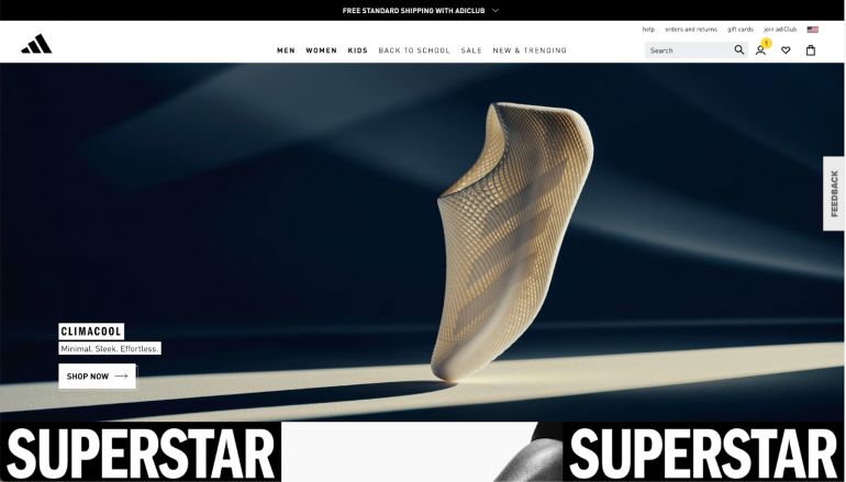
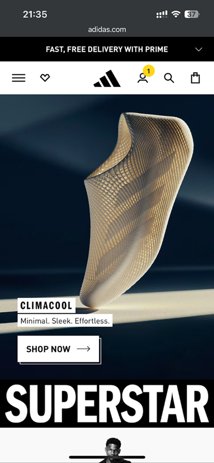
Check this out: the desktop and mobile versions of adidas.com offer users pretty much the same vibe. Smack in the center, you’ve got the key product and a button to buy it. Whether on desktop or mobile, just one click stands between the user and the purchase. Since the seller clearly bets on fast delivery as a hook, it’s highlighted in a banner on the homepage.
3. If the Style’s Consistent, You’ll Be Recognized — and Bought
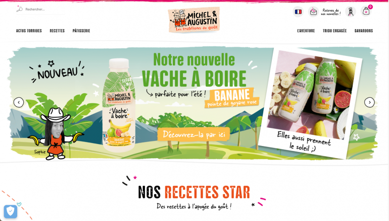
If you could boil all advertising down to one sentence, it’d be something like: “Repeat yourself as often as possible because people buy what they trust, and they trust what’s familiar.” For your brand to be recognizable, the style needs to echo across platforms, networks, text, and images. Take a French dairy brand as an example — their lively, inspired vibe shines through on their website and socials alike.

4. Design “Talks” to the Customer and Prevents Mistakes
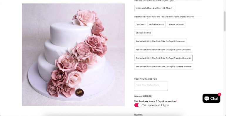
A site’s design feedback is like a visual chat with the customer. Look at ordering a cake, for instance. It starts standard: your choice gets highlighted or framed. The site lets you know what you’ve picked. But down below, there’s a cooler twist. Before ordering, the user must flip a switch to confirm they get that the cake will take at least 5 days to prepare. That’s a smart UX move to cut down on misunderstandings.
5. Design Speeds Up Sales
Back in the day, design had a rule: from a user’s intent (“I want a balloon!”) to action completed (a balloon bought), it should take no more than 3 clicks. Today, the rules are a bit looser, but the faster a user reaches their goal, the better.
Check this out. To get to the garland section, the user’s already clicked a bunch. Finally, they see the product: photo, price, reviews. Lots are ready to buy at this point, but… where’s the “Buy” button?
They’ve got to expand the specific garland page and hit “Buy” again there (if they don't change their mind about buying it by then). That’s an extra step to avoid.
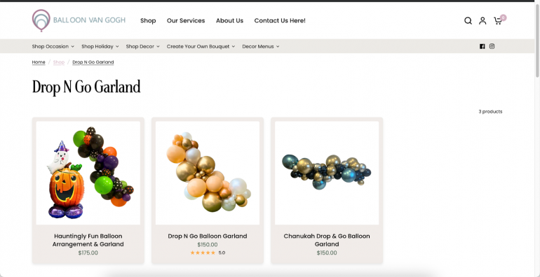
See?
Good UX design creates an impression, sells, prevents mix-ups, and sticks in memory. Bet on it if you want loyal customers and a killer experience for them.
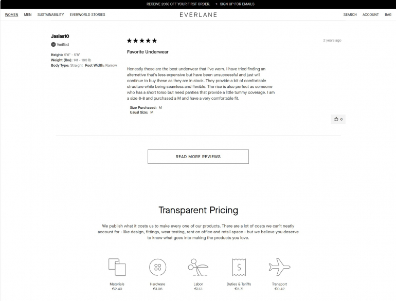
6. Smart UX Builds Trust — Even Before the First Click
Before users even interact with your site, they’re already judging it. Does it feel legit? Is it safe to shop here? That’s where trust signals come in, and smart UX weaves them into the design. Think visible customer reviews, secure payment icons, and clear return policies placed right where users expect them. For example, Everlane’s product pages include transparent pricing breakdowns and ethical sourcing info. When users feel informed and safe, they’re far more likely to convert.
Final Takeaway: UX Is the Silent Salesperson
Design isn’t just about looking good — it’s about guiding users, earning trust, and making decisions easy. From twinkling logos in 2004 to sleek mobile-first layouts today, the best ecommerce sites understand that UX is emotional, functional, and strategic. It’s the invisible hand that moves the customer from “just browsing” to “just bought.”
So, whether you’re revamping a site or building one from scratch, don’t just ask “Does it look good?”
Ask: “Does it work for the user?”
Because when UX works, sales follow.
Copyright © . All Rights Reserved