Designing for Conversion: How Smart UX Choices Boost SaaS Sales
If you're new to the SaaS game, a solid product alone won’t guarantee conversions.
Great user experience (UX) design is no longer a “nice to have,” it's a core driver of sales, particularly for SaaS companies. From the moment a visitor lands on your site to the instant they click “Subscribe,” every pixel should be working to convert. Smart UX choices can turn browsers into buyers.
Learn how UX design directly impacts SaaS conversion rates — from homepage hierarchy to pricing. We’ll explain how below with UX SaaS examples.
Why UX is a Sales Strategy, Not Design Fluff
At its core, UX is about helping users accomplish their goals with as little friction as possible. In SaaS, those goals typically include signing up, trying the product, and eventually, paying for it. Here’s the catch: users won’t stick around if they don’t understand your value proposition immediately.
Userpilot says, “Good UX removes obstacles that prevent users from reaching their ‘aha’ moment quickly.” That moment of clarity determines whether a user becomes a loyal customer or bounces forever.
The Homepage: Where First Impressions Convert
You have less than 15 seconds to convince visitors to stay. Your homepage needs to tell them who you are, what you do, and why it matters without making them scroll endlessly.
- Clear Value Proposition
- Visual Hierarchy and Simplicity
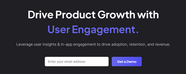
Place a powerful headline and subheading at the top of your homepage that clearly outlines what your software does. This clarity helps reduce cognitive load and encourages users to take action.
Stick to one or two primary calls to action (CTAs). Too many buttons or competing messages can confuse users. Use whitespace strategically to guide attention where you want it to go.
Pricing Pages That Don’t Make Users Work
Ah, the pricing page. It’s where conversion dreams are made or broken. A confusing or overwhelming pricing table can deter potential customers.
- Highlight the Best Option
- Be Transparent
- Offer Trials or Freemiums
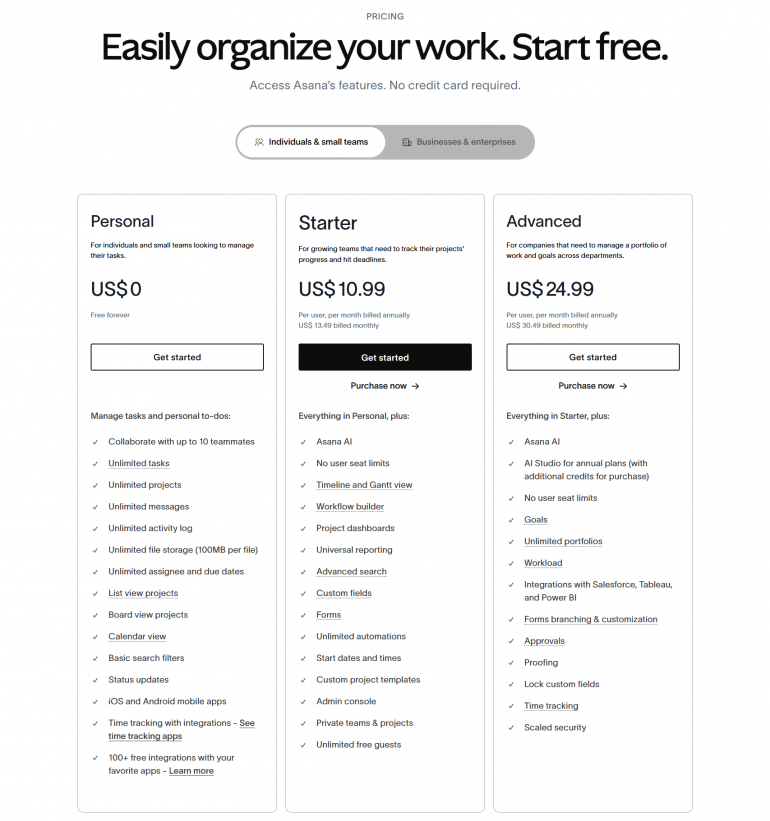
Use visual cues like color, borders, or labels (‘Most Popular’) to guide users toward your best value tier. Highlighting a specific plan increases conversions by creating decision certainty.
Display all costs upfront; no hidden fees, no surprises. PayPro Global advises investing in a global payments solution that allows SaaS businesses to stay compliant, offer localized pricing, and subscription management.
UX is about reducing psychological friction. Free trials or freemium models let users explore your product risk-free. When paired with a secure recurring billing infrastructure, the upgrade experience can be seamless and grow customer conversion rates.
Navigation That Nudges, Not Nags
A cluttered or unclear site navigation is asking your visitors to solve a puzzle before they even try your product.
- Keep It Minimal
- Persistent CTAs
- Figma blends upgrade nudges into the UI without disrupting the workflow. For example, when a user hits a feature limit, the upsell appears contextually, making it feel helpful, not pushy.
- Userpilot uses inspirational quotes and animations during loading to keep users engaged. It’s a small touch, but it reduces perceived wait time and reinforces brand personality.
- Amplitudes cookie policy modal is witty and on-brand. It shows that every UX element, no matter how small, can be an opportunity to delight users.
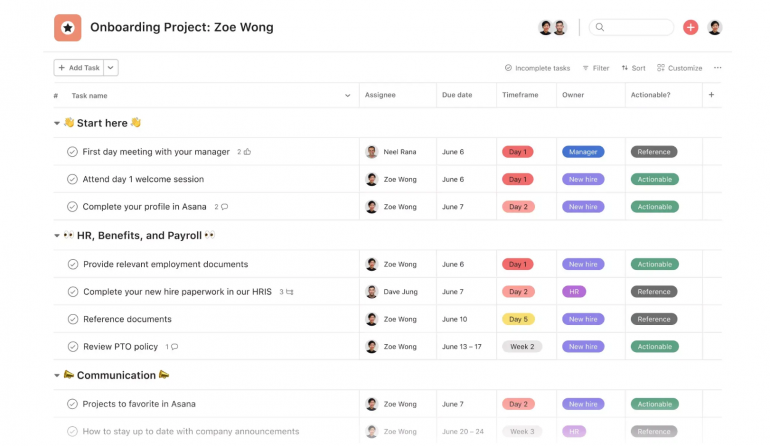
- Asana rewards task completion with whimsical animations (like flying unicorns). These micro-interactions make productivity feel fun and reinforce positive behavior.
- What makes UX design different for SaaS platforms? SaaS UX has to balance user onboarding, feature discovery, and long-term engagement — all while supporting self-serve functionality and complex workflows.
- How can UX reduce churn in a SaaS product? A smooth, intuitive experience helps users reach value faster and stay confident in your tool. Onboarding, support touchpoints, and clear task flows are key.
- What role does UX play in conversion optimization for SaaS websites? UX ensures CTAs are placed effectively, pricing is clear, and site performance builds trust — all factors that nudge visitors to sign up or subscribe.
- What should I consider when designing SaaS onboarding experiences? Personalization, task-based guidance, and progress indicators help users feel in control. Tooltips, checklists, and contextual nudges reduce friction.
- How does mobile UX impact SaaS success? A growing number of SaaS users access tools on mobile — if your experience isn’t responsive and fast, you’ll lose opportunities and frustrate customers.
- Can great UX improve upselling and feature adoption? Yes — when upgrades or premium features are introduced contextually, users are more likely to see their relevance and value.
- How do you test and optimize UX in SaaS products? Through user testing, heatmaps, journey mapping, and A/B testing of design elements. We also gather in-app feedback to identify points of friction.
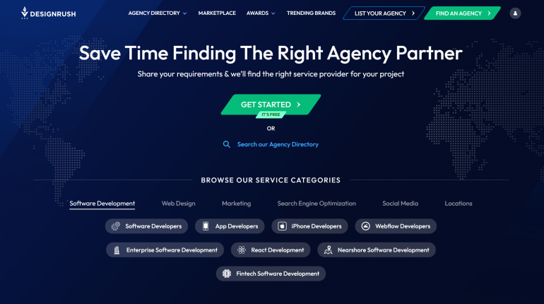
DesignRush says that brands are embracing minimalist logos. There's a good reason for that thinking. Minimalist logos improve load times and support the mobile-first ethos.
Sticky headers with a persistent CTA can remind users to act. Just don’t make them intrusive pop-ups that block content. Nobody likes that.
Mobile UX: Don’t Sleep on It
Your SaaS product may be web-based, but mobile traffic is a reality. If your mobile experience is clunky, users won’t hesitate to bounce. From the signup flow to the pricing page, ensure everything works and loads quickly on a mobile device. This includes mobile-optimized checkout with platforms that support responsive and localized payment experiences.
Onboarding: Where You Win (or Lose) Retention
You’ve got the sign-up. Great. Now what?
If your onboarding isn’t intuitive and helpful, that shiny new user might disappear faster than you can say “churn rate.” Use tooltips, checklists, or progress bars to guide users toward key actions. Customers who complete onboarding tasks are more likely to stick around and eventually upgrade. Tailor the onboarding experience based on the user's goals or role. A marketer and a developer don’t need the same tour. Segment early, and speak their language.
Upselling Without the Ick Factor
Good UX makes upselling feel like a helpful suggestion and not a sales ambush. UX strategies can present upsells contextually, when users are most likely to need them. Suggest feature upgrades at relevant moments. For example, if a user reaches their storage limit, show a message offering space with a plan upgrade that accepts payments. You're not only opening multiple online channels but also increasing revenue streams. It's a win-win eCommerce solution. Also, the transition from free to paid should be effortless. Some payment platforms allow embedded upgrades and secure transactions without disrupting sessions.
Wrapping Things Up
Smart UX design isn't about making your SaaS product “look good.” Rather, it’s about making it work better. Every design decision, from navigation to onboarding, can drive (or derail) your conversion funnel. Smart UX choices with great infrastructure. The next time you tweak a button or rethink a pricing page, know this: you’re not just designing; you’re selling.
SaaS UX best practices
Here are some standout SaaS UX examples that demonstrate how thoughtful design can drive engagement, reduce friction, and boost conversions — perfect inspiration for your content strategy:
Frequently Asked Questions (FAQ)
Copyright © . All Rights Reserved
