HTML5: Getting Started with SVG
SVGs (Scalable Vector Graphics) allows you to create images within your Web pages that scale up and down perfectly, whatever size the user device screen is. Additionally, you can implement interactive and animated functions within your SVGs. You can create dynamic SVGs all within your Web page code, using CSS and JavaScript as well as the many SVG elements.
- HTML and CSS: Design and Build Websites
- A Beginner's Guide to HTML, CSS, JavaScript, and Web Graphics
- HTML and CSS: Visual QuickStart Guide
- Head First HTML and CSS
- HTML & CSS: A Beginner's Guide
- JavaScript & JQuery: Interactive Front-End Web Development
- CSS3: The Missing Manual
- Murach's HTML5 and CSS3
In this tutorial, we will run through the basic processes involved in building an SVG within an HTML5 page. We will touch on interaction and animation along the way, as well as introducing you to some basic shapes and gradients. The end result will be a simple interactive stopwatch animation effect, with start and stop buttons allowing the user to control rotation of the watch hand. The result should function in the current versions of the major browsers, but may not be accessible in older ones.
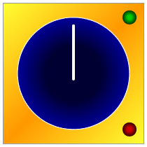
This is what the end result will look like:
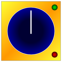
The user will be able to click the start and stop buttons to see the hand rotate around the dial.
Use the SVG Element
Start with the following HTML5 page outline:
<!DOCTYPE html>
<html>
<head>
<script type="text/javascript">
</script>
<style type="text/css">
</style>
</head>
<body>
</body>
</html>
We have our style and script sections ready for later. Inside the body section, add an SVG element as follows:
<svg id="stopWatchGraphic" xmlns="http://www.w3.org/2000/svg" version="1.1">
</svg>
The ID is not necessary, but we will use it to set the width and height from a JavaScript function. You could set the width and height as part of the opening SVG tag, but setting the dimensions in JavaScript will allow us to demonstrate how to create a graphic element that can scale easily.
In your style section, add a border to the SVG element so that you can clearly see its bounds within the page:
svg {border: 1px solid #999999;}
Definitions
The defs section of an SVG allows you to define reusable elements such as gradient fills. Add a defs element inside your SVG element:
<defs>
</defs>
Let's add some gradients inside the defs section: we need one for the background, one each for the start and stop buttons and one for the dial area. Start with the background:
<linearGradient id="backGrad" x1="0%" y1="0%" x2="100%" y2="100%">
<stop offset="0%" style="stop-color:#ffff33;" />
<stop offset="50%" style="stop-color:#ff9900;" />
<stop offset="100%" style="stop-color:#ffff33;" />
</linearGradient>
This is a linear gradient. The ID will allow us to apply it to the background shape when we create it. The x1, x2, y1 and y2 attributes indicate the starting and ending co-ordinates for the gradient. In this case it will run from top left to bottom right. The gradient has three color stops, at the start, end and halfway along.
Now add a gradient for the dial:
<radialGradient id="dialGrad" cx="50%" cy="50%" r="50%" fx="50%" fy="50%">
<stop offset="50%" style="stop-color:#000033;" />
<stop offset="100%" style="stop-color:#000099;" />
</radialGradient>
This time the gradient is radial. The only difference is that the gradient attributes indicate the central circle (fx and fy center point) and outer circle (cx and cy central point with r radius) between which the gradient will extend. In this case the gradient will simply run from the center of the circle to its outer edges, with the first color stop starting halfway along any shape filled with the gradient.
Add another two gradients for the start and stop buttons:
<radialGradient id="startGrad" cx="50%" cy="50%" r="50%" fx="50%" fy="50%">
<stop offset="30%" style="stop-color:#00cc00;" />
<stop offset="100%" style="stop-color:#003300;" />
</radialGradient>
<radialGradient id="stopGrad" cx="50%" cy="50%" r="50%" fx="50%" fy="50%">
<stop offset="30%" style="stop-color:#cc0000;" />
<stop offset="100%" style="stop-color:#330000;" />
</radialGradient>
Apart from the colors, these are similar to the dial gradient but with the first color stop starting at 30%, so with less of the first color represented in solid form.
Create Shapes
Let's create the shapes within the SVG.
Background
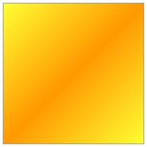
We are going to use a rectangle shape to represent the background of the graphic. Inside the SVG element, after the defs section:
<rect x="0" y="0" width="100%" height="100%" style="fill:url(#backGrad);" />
The rectangle starts at the top left corner of the SVG element and extends its full width and height. By using relative percentage values we can create a shape that will scale up and down whatever we set the overall dimensions of the SVG to be. We specify the background gradient we listed inside the definitions section by including its ID attribute.
Stopwatch Dial
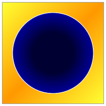
Let's add the stopwatch dial now, after the background rectangle so that the dial appears on top of it:
<ellipse cx="50%" cy="50%" rx="40%" ry="40%" style="fill:url(#dialGrad); stroke:#ffffff; stroke-width:1;" />
This time the shape is an ellipse, which in this case is a circle since the rx and ry (X and Y radius attributes) are equal. The cx and cy attributes indicate the central point of the ellipse shape, in this case the center of the SVG. We apply the fill we created and this time also specify a stroke, using color and width.
Stopwatch Hand
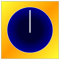
Add the stopwatch hand after the dial shape, using a rectangle:
<rect x="49%" y="15%" width="2%" height="40%" style="fill:#ffffff;" rx="1%" ry="1%" >
</rect>
The rectangle is positioned in the center horizontally, inside the bounds of the dial running from its center vertically up to near the dial edge. The rx and ry attributes specify rounded corners. We will be adding code inside this rectangle shape element later to animate it.
Start and Stop Buttons
Finally let's add the start and stop buttons:
<ellipse cx="90%" cy="10%" rx="5%" ry="5%" style="fill:url(#startGrad);" id="startBtn" />
<ellipse cx="90%" cy="90%" rx="5%" ry="5%" style="fill:url(#stopGrad);" id="stopBtn" />
The buttons are set to appear to the right of the dial, near the top and bottom. We use ID values for these shapes so that we can refer to them when instructing the browser to start and stop the animation as the user clicks them.
Animation
Now let's animate the dial hand. Inside the rectangle element in which we defined the hand shape:
<animateTransform id="rotateStopWatch" attributeType="xml" attributeName="transform" type="rotate" begin="startBtn.click" end="stopBtn.click" dur="60s" fill="freeze" repeatCount="indefinite" />
SVG offers a range of animation options - in this case we are using an animateTransform so that we can rotate the shape. We specify a rotate transform using the attributeName and type attributes. The begin and end attributes use the ID values we gave the start and stop button shapes, to specify that the animation should begin and end on clicking those shapes. We indicate a duration, freeze the animation when it stops and set it to repeat indefinitely. We could optionally include the following attributes indicating the start and stop positions of the animation with the degrees, rotation center X and Y points:
from="0 100 100" to="360 100 100"
However, since we have used relative percentage values throughout the rest of the code we will set these properties in JavaScript when we set the SVG dimensions - the from and to attributes cannot take percentage values. The fixed values above would work where the SVG has been set to 200 width and height, which is what we will do to demonstrate.
Styling via JavaScript
Now let's get some JavaScript in place to set the dimensions dynamically. In the script section, add a function:
function setDimensions(){

}
Inside the function specify the width and height:
var width=200;
var height=200;
Now get a reference to the SVG element and set the dimensions:
var svgElem = document.getElementById("stopWatchGraphic");
svgElem.style.width=width+"px";
svgElem.style.height=height+"px";
Now get a reference to the animation element to set the rotation central points:
var stopWatch = document.getElementById("rotateStopWatch");
Calculate the central points using the width and height:
var centerX = width/2;
var centerY = height/2;
Prepare the from and to attributes:
var from = "0 "+centerX+" "+centerY;
var to = "360 "+centerX+" "+centerY;
Set the animateTransform attributes:
stopWatch.setAttribute("from", from);
stopWatch.setAttribute("to", to);
Finally, after the function but still inside the script section, call the function when the page content loads:
window.addEventListener("DOMContentLoaded", setDimensions, false);
That's the SVG complete! Save and open yours in a browser, clicking the buttons to start and stop the stopwatch hand rotation.
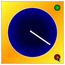
Experiment by trying different width and height values for your SVG. Now that you have a functioning interactive animated SVG, play around with the shapes, gradients and animation to get a feel for what you can do.
Need more info about HTML5? Download our HTML5 eBook for free and enjoy its quality.
About the author
Copyright © . All Rights Reserved
