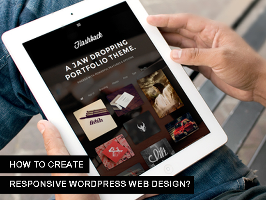
How to Create Responsive WordPress Web Design?
With millions of users around the world, WordPress is the most widely used content management system. However, there has still been a lot of talk on how to do responsive web design on WordPress sites.
Related Posts:
That is not surprising, really. While WordPress makes adding content and overall management of your site very easy, creating a responsive Web design is rather different. Responsive Web design helps you display your site perfectly on the ever-growing number of devices and different screen sizes that exist now.

So just how exactly do you do it? Here are some tips:
1. Get a responsive theme from the start.
The good thing about WordPress is that there are a lot of themes that you can choose from to help you easily get the look and feel you want for your Web site. You would need to see just how customizable the theme is and how flexible it is. Now, you can just add being able to handle responsive Web design out of the box on your list of criteria.
Getting a theme that can help you do responsive web design is the quickest way to ensure that your WordPress site displays perfectly on any screen.
Subscribe to newsletter and grab our amazing responsive WordPress theme, optimized for social media totally for FREE!!!
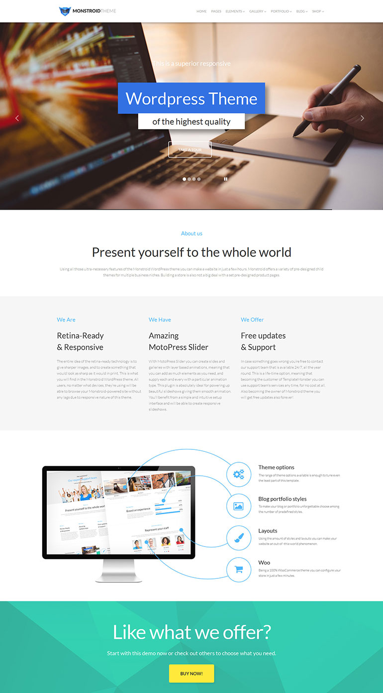
And the good news - There is no shortage of Monstroid WordPress Theme
Style Park WordPress Theme
Kustrix WordPress Theme
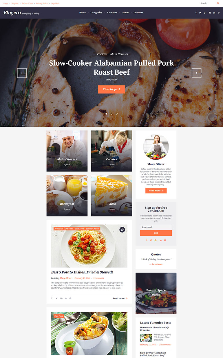
Blogetti WordPress Theme
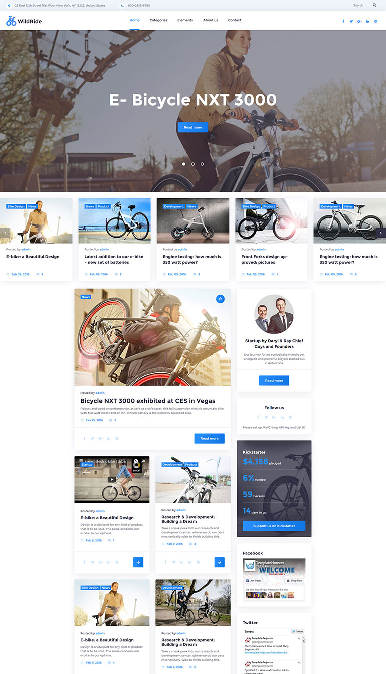
WildRide WordPress Theme
How to choose your responsive theme:
Looks matter. This should be your first consideration when choosing a theme. A theme should be able to give you the look you want without having to spend days and hours customizing it.
Performance matters. Themes may often affect your site's loading speed, so stay away from themes that call on too many files, or forces you to load files with too many kilobytes. A theme should not slow your site down.
Customizability. This is probably not a problem if you are buying a theme, but if you are looking for free ones, then there might be some limitations on what you could customize and personalize with your theme.
2. Transform your current theme into a responsive one.
If you already have a theme that you now use for your desktop Web site and if you really like the look of that one, except that it is coded in pixels rather than percentage, then work on making it more responsive.
How do you do this?
a. Get your media queries in order.
When you get a WordPress theme, you should have a stylesheet that is used on both mobile and desktop versions of your site. You would only have to specify how particular screen sizes would be different from this default style.
You would need to define the maximum width that this set of styles changes would apply for. To do that use:
@media screen and (max-width: 320px)
This means that for screen sizes measuring 320 pixels wide or smaller, a different set of styles would be used.
Other screen sizes you might want to use are 480 pixels, 780 pixels and 1024 pixels.
b. Know how to deal with images.
Images can be a problem if they are too big and they spill out of their containers. To ensure that this never happens, add the following code to your CSS
body img {
max-width: 100%;,br />
}
Either that or you upload different image sizes, which will be loaded accordingly depending on the size of the device used.
c. Use the appropriate text size.
When working with a smaller layout on a small screen, your text might appear very big. So just adjust the text size using this handy code:
body {
font-size: 60%;
line-height: 1.4em;
}
d. Change other elements appropriately.
Other elements in the layout that you need to change include the overall width of the site, the sidebar, the content, footer and widgets.
e. Know how to deal with navigation.
There are a lot of techniques to help you get a more responsive navigation on your site. For one, you could use a drop down box rather than a navigation bar. Or you could have your navigation menu take up an entire page and create an app-like environment for your site. Or even getting plugins to handle the navigation menu for you.
3. Plugins
Plugins are a good idea if you do not want to change your current theme. If mobile visitors are not exactly a priority for you right now, but at the same time you also do not want them to get stuck with a sucky experience while browsing through your site on their Android phones, then you might want to consider plugins.
Furthermore, if you have a Web site that is less focused on graphics and layout, then plugins would be a viable solution. This is especially true for personal or business blogs, or a news site. Web sites that are focused on content would do well using a plugin for responsive design.
One of the plugins you can try out is WPTouch.
WPTouch removes some elements of your existing theme and displays your content perfectly on any screen size. If you want to be able to include some graphics, personalize the theme with color and style changes and add other elements, you can pay for this plugin to do all that.
Here are other popular plugins you can try for you to have a responsive WordPress site:
- Page Builder - This is for your page's column layouts. Works on both responsive and non-responsive themes.
- Sinking Dropdowns WordPress - This plugin transforms the old and clunky menu into a responsive dropdown menu.
- Fluid Responsive Slideshow - For WordPress sites that have slideshows or image galleries, this plugin is perfect for you. With FRS, you don't have to be an expert to properly integrate slideshows to every post or page.
These are just some ways on how to do responsive Web design on WordPress. Using these ideas, you can now start implementing to have your WordPress Web site display perfectly on just about any screen.
Watch me build a Responsive WordPress site from scratch! - Video One
Wordpress books from Amazon:
Watch me build a Responsive WordPress site from scratch!
If you'd rather have someone build a responsive Wordpress site for you, then contact a local web developer to help you out.
Free Responsive Design eBook
Wanna know how to create responsive web design? This FREE basic guide will help you to start. Read more about eBook or download it via form below:
About the author
Copyright © . All Rights Reserved


